Connecting the dots: how UX optimisations are driving success rates
In today’s instantaneous, digital landscape, customer experiences can shift based on what may seem like minor tweaks. Understand how to make small yet impactful changes with Tink’s recent UX updates, designed with success rate optimisation in mind.
Open banking flows – what are they?
Before we dive into the weeds, it’s important to have an understanding of what a typical open banking flow looks like. Skip to the next section if you’re already familiar with this.
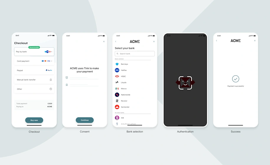
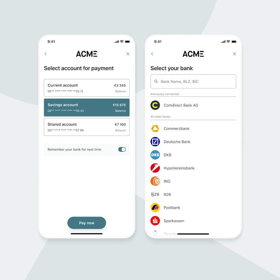
An example payment user flow
Here is a journey where a user takes a series of steps to complete an action, such as making a payment in this example, or proving account ownership. It can broadly be broken down into the following steps:
Checkout: the user selects Pay by Bank at checkout or chooses to prove account ownership through open banking
Consent: user permission is requested to initiate the process
Bank selection: the user is prompted to pick their bank from a list
Authentication: depending on the bank, market or other conditions, the user is taken to the appropriate authentication method
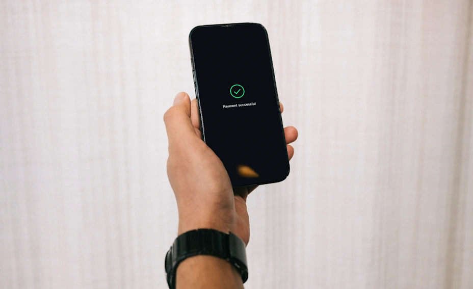
Success: the definition of success differs depending on the product and use case. For PIS (payment initiation services), it’s usually a payment confirmation screen, while for AIS (account information service) products, it’s usually to confirm that the data has been aggregated successfully.
If a user successfully makes their way through each stage of the flow, this contributes towards what we call the ‘end-to-end success rate’. If a user drops out or fails to complete the flow, this is where a better optimised user experience (UX) comes into play.
The big impact of small changes
Now we know what a typical open banking user journey looks like, let’s take a look at how our teams have been hyper-focused on tweaking our UX to make these journeys slicker than ever. Below we’ll highlight some of the more notable changes where our customers saw the biggest impact on end-to-end success rates from a whole host of tests our teams recently ran.
Paying multiple invoices in one easy flow
Traditionally, online invoice payments are one-to-one (i.e. you pay your rent bill separately to your internet bill). This means that for each individual invoice, customers need to repeat the entire payment process. Across the EU, customers pay multiple invoices on a monthly basis, which can result in an unnecessarily repetitive and tiresome process. If we take Sweden as an example, invoices are the second most common way of paying online – and are used by over 50% of the population, according to the Central Bank of Sweden*. You can imagine the amount of time spent by the population just on paying invoices alone.
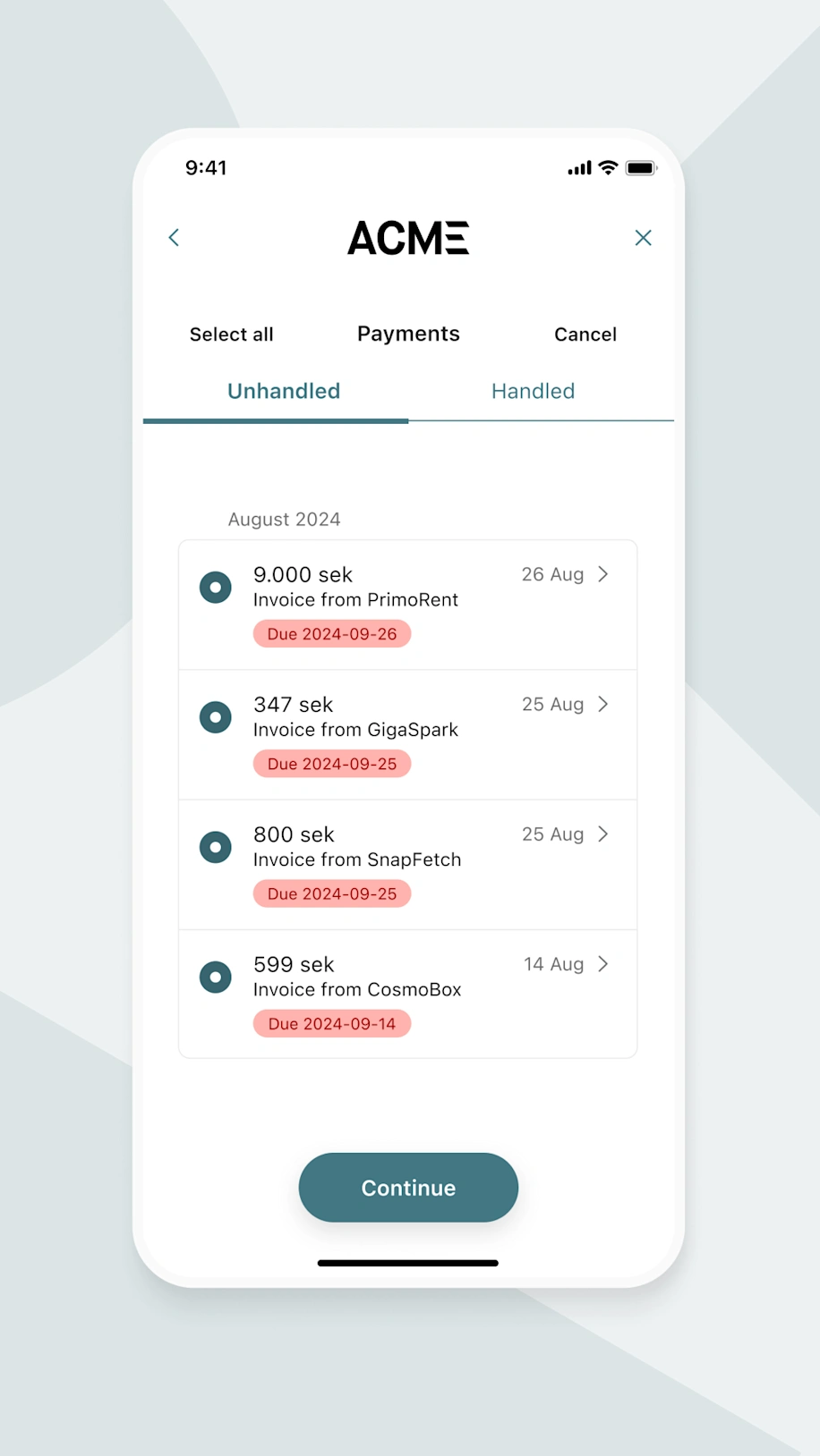
Users can pay multiple invoices simultaneously with bulk payments
To combat this issue we introduced a new feature to help simplify the invoice payment process: bulk payments. This enables end users to pay all of their invoices in one go, providing a number of benefits for Tink customers:
Shorter payment journeys: allowing users to sign multiple payments in a single authentication flow, significantly reducing the time it takes to pay them all individually
Contributing to greater user satisfaction: for invoice-heavy markets, having to pay invoices separately is a key point of friction for users
Potential increase in payments volume: enabling users to easily pay multiple invoices within the same interface is likely to keep them coming back.
Initially in Sweden, we have seen an average of three invoice payments per transaction, taking just 37 seconds to complete. Previously, it would have taken around two minutes to pay all three invoices. And now it doesn’t matter if the user is paying three invoices or ten – the time difference to complete the payments is minimal.
You can learn how to bundle up to 100 invoices into one payment request here.
Preventing mistakenly cancelled flows with just one screen
User cancellations are a burden to success rates. It's inevitable that a small percentage of users will cancel the flow for one reason or another. However, it's the unintentional cancellations that truly hinder market-leading success rates. More often than we’d like to think, user flows are cancelled due to inadvertent errors rather than a deliberate desire to exit the flow.
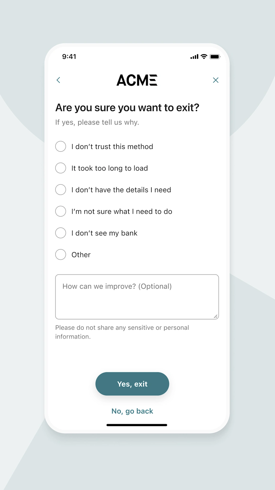
The new exit screen prevents users from accidentally dropping off
This is why we introduced a new exit screen to Tink products, which prevents users from accidentally dropping off – while providing the opportunity to acquire direct feedback from users who actively intend to cancel.
Users are asked to submit a reason for cancellation, with the option of providing qualitative feedback for additional context. The initial impact to end-to-end success rates has been nothing short of remarkable.
At the time of writing, in nearly 1 million sessions where the new exit screen was shown, approximately 150,000 users returned back to the flow to complete it. That’s a recovery rate of 15% of users who were ready to cancel.
Streamlining returning users’ experiences
For frequent buyers, having to repeat the entire payment process can become a monotonous experience. To make returning users’ lives easier, the new ‘remember my bank’ toggle allows users to explicitly opt in to remembering their bank, which places it at the very top of the bank selection screen the next time they return.
So far, our metrics show that 85% of returning users who are shown their previously connected bank will select the same bank again. The time it takes for a user to select their bank has dropped dramatically, from an average of 5.5 seconds to 2.3 seconds.
This feature alone has contributed towards a rise in end-to-end success rates of 8% for users who opted in, compared to users who do not have their bank pre-selected.
The 'remember my bank' toggle enables bank preselection for returning users
Bringing popular banks front and centre
Tink’s bank selection screen allows users to find their bank using the search box, or by scrolling through an alphabetically sorted list. Either way, there is a small group of banks that the majority of people typically use.
By grouping the most common banks together at the top of the screen, tailored to the country in which the user resides, this eliminates the need to spend time scrolling or searching.
The likelihood of a user’s bank being shown in the ‘most common’ list is pretty high – in mature markets such as Sweden and the UK, over 90% of users connect with banks from this group.
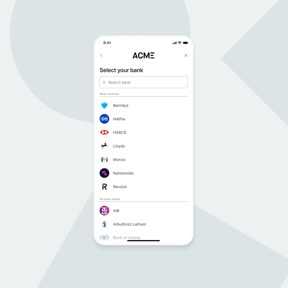
An example of common UK bank grouping
Assisting users along the way
Occasionally, users need a guiding hand to explain how or why they're required to complete certain steps. This is especially true when they need to prove account ownership prior to making a payment. Clickable callouts have been added to the authentication process, tailored to the method of authentication available, to explain why the user must authenticate twice.
In Germany for example, those who use a card reader will be provided with an explanation of how to obtain and submit the relevant TAN code. In Sweden, the user will be prepared to authenticate twice using their mobile BankID app.
Reassuring users as to how and why they need to authenticate builds confidence and reduces the number of unnecessary drop offs.
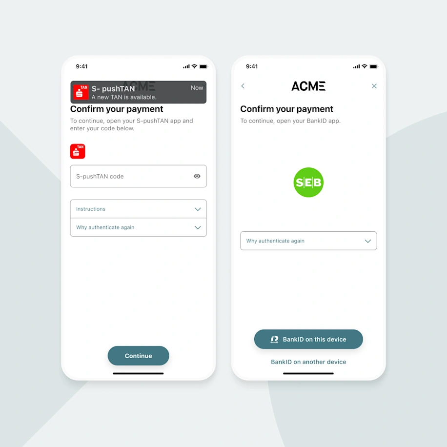
Clickable callouts explain why users may need to authenticate twice
Reflecting the look and feel of merchant brands
Tink Link has long been customisable, allowing you to adapt the appearance to match that of your company brand. Through the Tink Console, you can upload a logo, adjust colours, fonts, alter buttons and more, in one simple editor.
For payment service providers (PSPs), we’ve introduced the option to customise each merchant individually. This feature is now available for merchants who utilise Pay by Bank and results in a seamless transition between the merchant and Tink flows, ensuring users feel safe and secure in using the service.
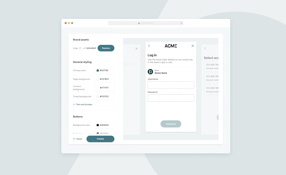
PSPs can now customise individual merchant flows through the Tink Console
Enabling hybrid experiences in payment journeys
For context, there are two methods of integrating Tink products with your services:
Redirect integration – where Tink runs in the full browser window
Iframe integration – where Tink is embedded inside part of a web page or app
Redirect integration
Typically, we recommend the redirect integration method as this is most suitable across platforms and devices. The user journey follows a linear path where users move from step to step, from the point of initiation through to the confirmation message. The following simplified user flow depicts this linear path:


iframe integration
The iframe integration offers a non-linear experience, where instead of the user progressing screen-to-screen, a popup opens in a new window or mobile browser tab for authentication purposes before returning the user to the flow.

This can work well for desktop experiences. However on mobile devices, this integration type has historically been avoided. On mobile, a new browser tab is opened for the user to authenticate which, once completed, may leave the user outside of the original user flow with no obvious way to return back – other than having to close the tab and manually find the original tab.
Further reasons as to why we’ve advised against this integration method is that popups can be blocked from opening on desktop, there may be sizing and layout issues on mobile and scrolling can be challenging when the iframe is nested within a larger page – all resulting in sub-par user experiences.
Hybrid integration
To resolve these issues, we've recently tested a new hybrid integration with a pilot customer that combines the best of both redirect and iframe integrations. The first part of the journey is experienced in an iframe, then instead of a popup opening at the authentication stage, the entire web page is navigated away, which removes the issues associated with popups on mobile devices. Any subsequent steps occur in a full-screen experience, just like how an ordinary redirect integration works, prior to automatically returning the user back to your service upon completion.

The benefit of this approach is that for specific use cases, the user journey starts on your website, allowing you to add your own content around the iframe if required. Common issues such as blocked popups or users ending up outside of the flow are eliminated due to the redirect journey initiating at the authentication step. Do keep in mind that it's still important to take into consideration how the initial iframe is placed within the website to avoid spacing or nested scrolling issues.
The work doesn’t stop here
Iterating and testing with user experiences is a continual investment – one which pays off with market-leading success rates. The journey doesn’t end here, as our teams continue to work hard to improve user experiences. We’ll continue to share our progress throughout the year, with actionable insights that you can implement in your own Tink integrations.
Want to dive deeper into the world of UX optimisation – in particular for account-to-account payments? You’ll find the below reads interesting:
With this guide, we reveal how you can build and optimise your Pay by Bank flows to ensure the highest possible conversion rates.
In this webinar, our team discusses how account-to-account payments can vastly improve your user journey – and demo how it works.
We go deep on open banking conversion rates – and show how today’s benchmarks are already higher than you might think.
Ready to future proof your UX with our payment services and data enrichment platform? Get in touch with our team today.
–
About the research
*Sveriges Riksbank, 'Payments in Sweden', 2020, https://www.riksbank.se/globalassets/media/rapporter/betalningsrapport
/2020/engelska/payments-in-sweden-2020.pdf
All performance statistics references above are based on Tink data collected between Jan–Jun 2024.
Case studies, statistics, research and recommendations are provided “AS IS” and intended for informational purposes only and should not be relied upon for operational, marketing, legal, technical, tax, financial or other advice. Tink does not make any warranty or representation as to the completeness or accuracy of the Information within this document, nor assume any liability or responsibility that may result from reliance on such Information. The Information contained herein is not intended as legal advice, and readers are encouraged to seek the advice of a competent legal professional where such advice is required.
More in Product

2025-10-07
7 min read
Beyond instant: Building reliable Pay by Bank payments
As instant payments roll out across Europe, merchants still face challenges with reliability and settlement. Our Smart Routing and Risk Signals products provide a reliability layer for Pay by Bank, optimising payment routes and blocking likely-to-fail transactions.
Read more

2025-02-06
6 min read
Introducing User Match: Built-in name verification to make security fast and easy
Discover how the latest feature of our verification products, User Match, is improving security by verifying users' names when adding bank accounts, reducing fraud and enhancing account protection.
Read more
2025-01-15
1 min read
Guide – How to optimise verification with open banking
Download our new account verification guide to learn how to streamline your operations, reduce risk, and enhance customer experience with the help of open banking-powered solutions.
Read more
Get started with Tink
Contact our team to learn more about what we can help you build – or create an account to get started right away.