Introducing customisable logos and desktop layout inside Tink Link

Now it’s easier than ever to provide your customers with a more seamless user journey: with customisable logos, you can add your own logo inside the Tink Link authentication flow. And with our new responsive desktop layout, your customers won’t need to squint to see it.
We’re launching two new Tink Link features to further streamline end-user journeys: responsive desktop layouts and customisable logos.
Desktop layout utilises the larger screen space to improve readability, accessibility, and boost conversion rates.
With customisable logos you can add your own logo to the Tink Link authentication flow. This provides a seamless integration with your application.
At Tink, we’re all about creating the best user experience. That's why Tink Link is designed to make things easier for you and your end-users (for instance, by enabling no-code integration).
As our front-end SDK for end-user authentication to banks, Tink Link needs to seamlessly blend into your end-user journeys. To achieve this, our UX design team continuously makes design iterations to provide the best end-user experience.
We decide what changes to make based on user feedback and data – so you might be glad to hear that you can now add your logo inside Tink Link for a seamless experience. And that's not all: Tink Link is now optimised for both desktop and mobile devices.
Improved accessibility with desktop layout
Before, Tink Link was primarily optimised for mobile devices, since that is where we see the majority of end-user journeys happening. But as it turns out, end-users found the Tink Link mobile layout too small and hard to read on tablet and desktop devices. And as this hardly complements your user experience, we decided to do something about it.

In response to some of our customers building desktop-first use cases, we’re rolling out Tink Link with support for a responsive desktop layout. The new responsive layout better utilises the larger screen space to improve readability and accessibility. A more unified user experience will in turn lead to better conversion rates.
A more seamless end-user journey with customisable logos
One of the key design principles for Tink Link is to make it blend into our customers’ applications. To make the end-user journey a more cohesive experience, our customers can now add their own logo inside Tink Link. The new update puts your logo front and centre, while Tink will be less visible to the end-user. This creates a seamless Tink Link integration within your own application, while having your logo on screen provides the necessary context and assurance that the end-user is still within your flow.

To help you create an ideal journey that smoothly blends into your own application, Tink Link has added another change: instead of the Tink logo and Tink Link name, the browser tab now shows your name with a generic icon.
No more jumping between different app experiences: customisable logos and browser tabs assures the end-users that they’re still in your flow, leading to a better end-user experience with increased success rates.
Customisable logos are available to everyone starting now, just put in a support request or contact your account manager. They will also be built into the Tink Console later this spring.
Desktop layout is currently being rolled out to select customers, and will be available to all customers from early March.
New to Tink? Learn about how to get started here.
More in Product

2025-10-07
7 min read
Beyond instant: Building reliable Pay by Bank payments
As instant payments roll out across Europe, merchants still face challenges with reliability and settlement. Our Smart Routing and Risk Signals products provide a reliability layer for Pay by Bank, optimising payment routes and blocking likely-to-fail transactions.
Read more

2025-02-06
6 min read
Introducing User Match: Built-in name verification to make security fast and easy
Discover how the latest feature of our verification products, User Match, is improving security by verifying users' names when adding bank accounts, reducing fraud and enhancing account protection.
Read more

2025-01-15
1 min read
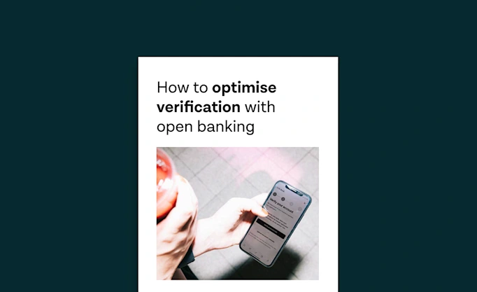
Guide – How to optimise verification with open banking
Download our new account verification guide to learn how to streamline your operations, reduce risk, and enhance customer experience with the help of open banking-powered solutions.
Read more
Get started with Tink
Contact our team to learn more about what we can help you build – or create an account to get started right away.
