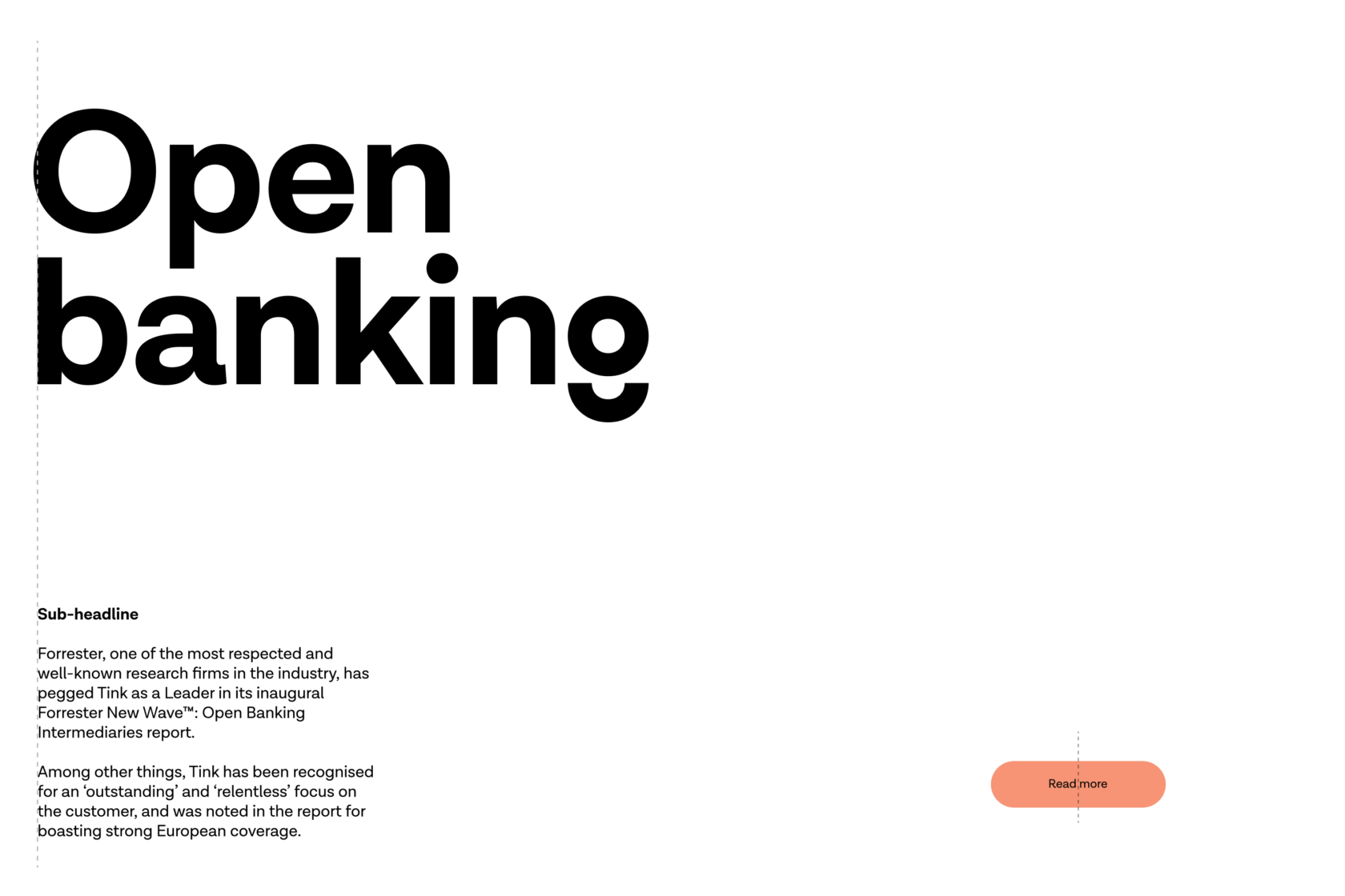
Typography
Lota Grotesque is a typeface that reflects the values of our brand and is part of the Tink personality. It is available in a wide range of weights and styles, but in order to keep things simple and consistent Tink uses three of these.
Downloads
Lota Grotesque
Three weights
HeadlinesLota Grotesque Bold
Sub-headlinesLota Grotesque SemiBold
Body copyLota Grotesque Regular
Settings
AlignmentLeft aligned
ExceptionsText may be centred in buttons
Sizes
Strive for a few sizes in the same layout, ideally never more than three. Use sizes evenly divisible by four.

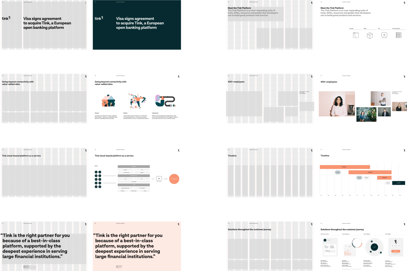
Layout
Grids and columns help us create dynamic and asymmetric compositions.
Fallback typography
In instances such as Google Slides, where Lota is not applicable we use Helvetica Neue.

