Motion
Motion design is an important element of Tink’s visual identity. It can be used to express our brand’s personality and style across different touchpoints. It can set the tone for our brand and connect with our audience on an emotional level and help make content easier to digest and more fun to interact with.
Downloads
Animated logoLiving holdsBumpsHow we move
Our mission is to power the new world of finance. We strive to create animations with fast movements with a lot of hard cuts to convey our energy. We move in a simple and clear way but with energy and purpose. We only use bouncy, elastic elements on our UI animations as well as on our brand illustrations – as they need to be animated in a more organic way.Always keep a dynamic mix of design elements (colours, typography, photography, illustrations, etc) and don’t apply motion without a reason. Don’t overuse motion– often less is more. Use motion only when it enhances the message.
Transitions
Some transitions feel more like Tink than others. Here are three transitions that we think work well for Tink:

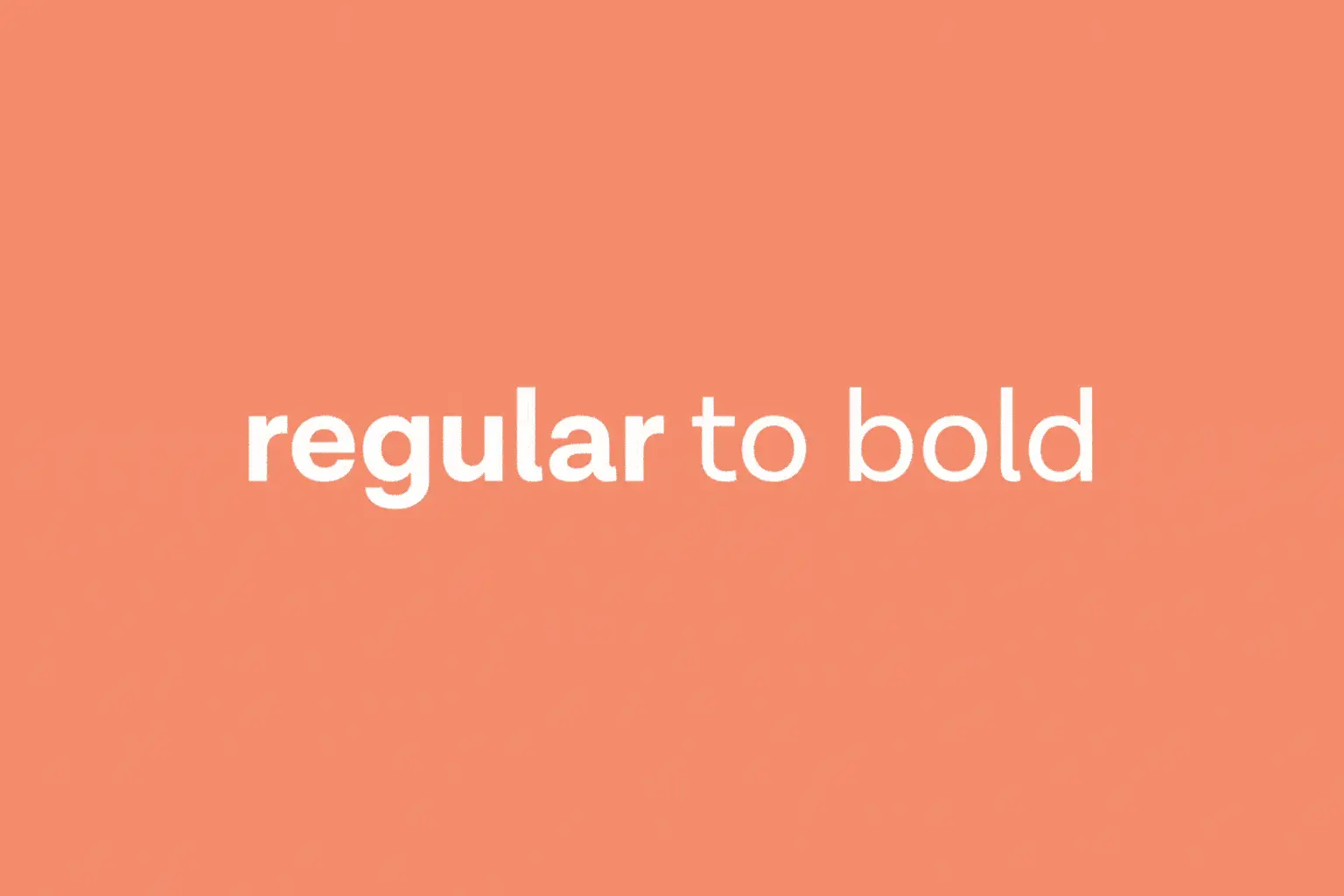
Typography
We generally prefer not to stretch or do anything unconventional with fonts. We try to stick to the following type animations:


Icons
Icons can serve both functional and decorative purposes. Pay attention to their shape and see how position, scale, rotation, depth, can be used.