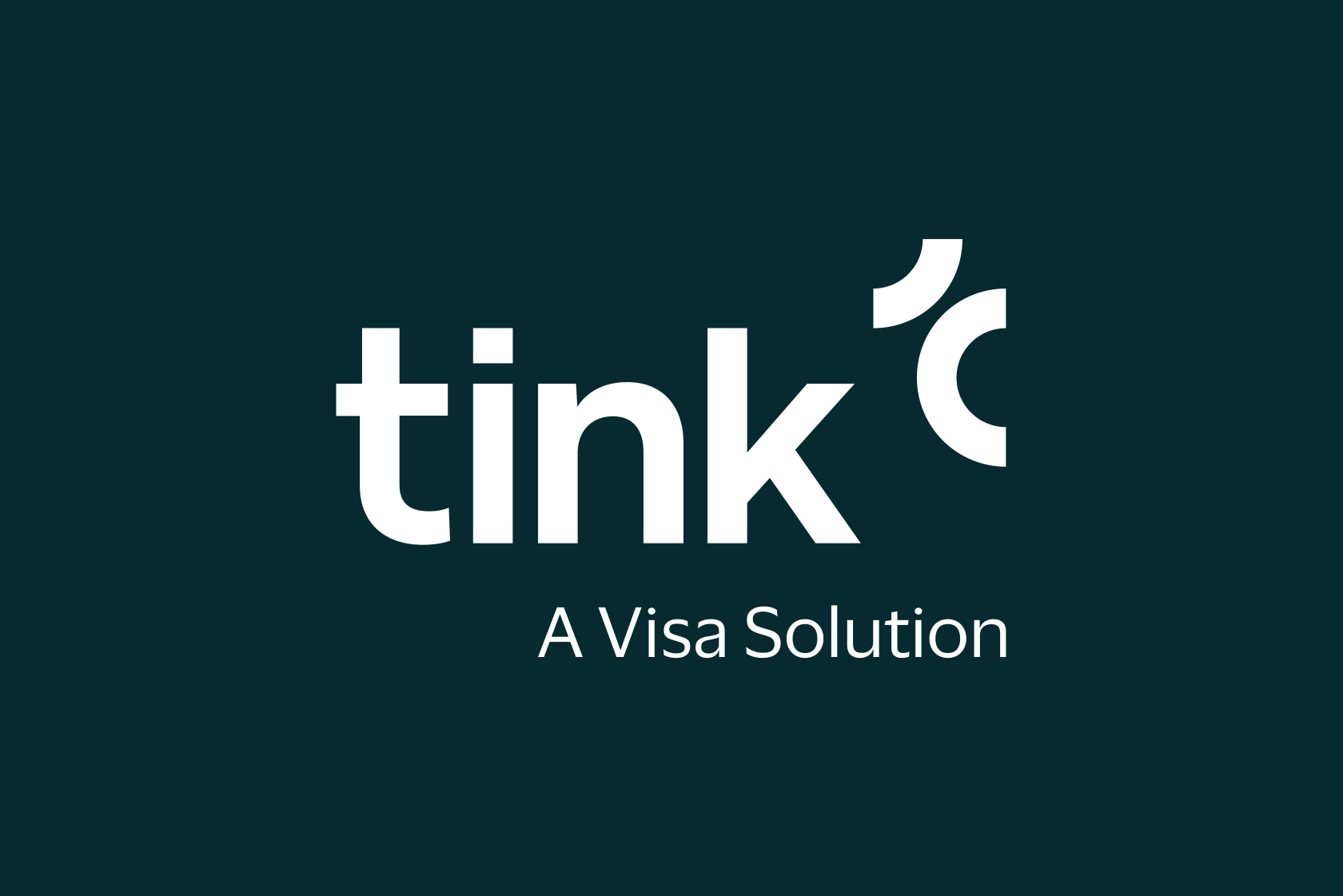
Logo
The Tink logotype is our most important identity asset. It will become familiar and recognisable, both within and outside the company, and must appear on all official Tink communication. The logotype is our sign-off or endorsement. It will always appear in a position reflecting the authority and trustworthiness that the Tink brand stands for.
Downloads
Tink LogoColour combinations


Clear space
The Tink logotype should always be surrounded by sufficient clear space in order to appear as clear and distinct as possible. The clear space is based on the 1/4 circle in the symbol.
This measurement is the minimum space allowed around the logotype and should always be applied in all instances. It is important to point out that the defined clear space is a minimum, it is of course allowed and recommended to go above this in order to create clear and consistent designs.
Standard sizes
Digital16:9: –
PrintA6: 25 mm
A5: 25 mm
A4: 30 mm
A3: 35 mm
A2: 70 mm
Minimum size: 25 mm
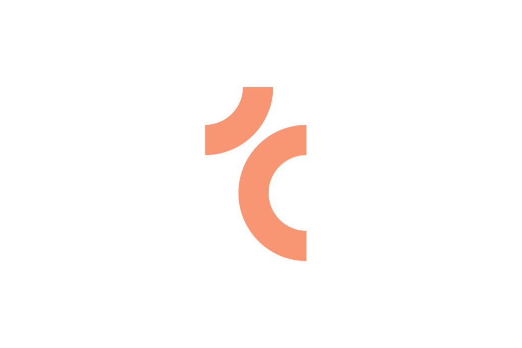
Symbol
The Tink symbol is the simplest graphic representation of the brand. The symbol is an abstraction of the initial ”t” of Tink. The two parts of the symbol represent the open meeting between us and the customer but can also represent our doughnut which has become symbolic of Tink.

Symbol colours
The symbol can be used in isolation when Tink is established as the sender. In those instances, we apply a larger degree of flexibility when it comes to colours.
Symbol clear space
Clear space follows the same logic as for the logotype.
Symbol sizes
Digital16:9: –
Minimum size: 20 px
PrintA6: 8.5 mm
A5: 8.5 mm
A4: 10 mm
A3: 11.5 mm
A2: 23 mm
Minimum size: 8.5 mm
Avatars
In social media, the symbol is centered and optically adjusted to the left.